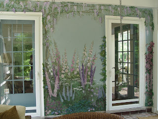
Friday, June 1, 2012

The Artistic Utilitarian (no longer an oxymoron)

                 util·i·tar·i·an /jʊˌtɪˈterijən/ adjective
     1: made to be useful rather than to be decorative or comfortable

In the world called "Beautiful", there are some imperfections we love.  They can set things apart; make them unique.  The one odd red chair in a room can suddenly make it feel balanced or bring an inspiration of fun.   
Imperfections can be celebrated.  But, sometimes, they can't.

So often, a room design is implemented and comes together beautifully, until...
the utilitarian comes to play:

outlet covers, heating vents, ironing boards, speaker covers -
the kill-joys of the design world.

Over the years, I have come to the realization that everything can change.  Nothing has to stay the way it is.  Objects may still have to be around us for function, but they do not have to be seen.  Isn't paint a wonderful thing?  Even the most functional object can become artistic and stylistic.

            1cam·ou·flage /ˈkæməˌflɑ:ʒ/ noun1 [noncount] a : a way of hiding something by painting it or  covering it with  leaves or branches to make it harder to see - "indiscernible from the surrounding environment through deception."
Did you catch that?  Deception!  This is when it is okay to be deceitful...all parents approve.

Look!
                        Generic lumberyard floor vents become deceptive chameleons.


                Electrical covers over new and expensive tile are a design blemish requiring attention.


ironing boards...


speaker covers...


                                ...everything can become a piece of the design element.

    To inspire even more opportunities in the art of disappearing and camoflauge, I suggest looking at the art of Liu BoLin who uses his spectacular ability to "become invisible".  http://www.liubolinart.com/

Electrical covers are silly in comparison to his work, but the people who have watched them disappear are almost more ecstatic about that camoflauge than they are about their new tile. 

It's the little things...


Thursday, March 1, 2012

Sports Fans

The sports world has kindly evaded me most of my life.  However, now that I have a young boy, I am experiencing the maternal thrill of watching my child throw himself completely into a game.  I am now admittedly loving the soccer mom experience.

Enter...sports.
Home and work...


My daughter, Sidney, helps me on a regular basis.  She too, was never concerned with team athletics.  But, this month, our creative days have found themselves wrapped around the basketball industry.  The research before a project has always been almost as fun as the project itself.  We now know that "Celtics" is pronounced with a soft 'C', that the NBA's quarters are 12 minutes long and that Magic Johnson and Larry Bird are the same height.


This room was envisioned by a 13-year old with a love of the "old-school" players.  There were not the appropriate "Fat Heads" to stick on the wall, so I was hired to apply them...with paint.  Oh, the wonders of paint.

The room has little tiny basketball hoops on each side that get used daily.  When the request was made to have the players around one of the hoops, my response was, "Sure."  But, upon drawing Michael Jordan, Sidney and I quickly realized that the ball was not going to go into that net. Therefore, we expanded the visual size of the board and net so Mr. Jordan could now sink that ball.


The mural then expanded to include a crowd scene.


and then...

...a valance was created to complete the room.  Here, I learned quarter times and that when a green light is on under the "POSS" it is letting me know who has the ball. :)

Oh, but wait...the bathroom!  I suggested adding the signatures of the players in here.  The idea continued to expand from there and the idea was presented to make the whole room into a basketball looking like the signatures were signed on it.  A shower curtain was sewn and I painted it to complete the look.  Sidney was the "forging queen" for this part of the project.  What did I learn in this room?  Sidney used to forge my signature often in high school....  apparently, the practice paid off. 

Monday, February 13, 2012

My "Dream" Project


In my last posting, a full year ago, I can be quoted as saying, "I have yet to be asked to paint a Winterscape."  The quote was made because I have done a large number of beach scenes, but had never been asked for a winter scene.

From May to October this past year, I spent my time working on not only the largest project I have undertaken to date, but was also given the most precious gift of complete creative freedom to accomplish my vision for my client's space.  With the only directive being a specific subject matter chosen by my clients and their designer, I was able to focus on all the specific details that made the end result perfect.

 In this subject matter, I found the "winterscape" commission I've been longing for, as well. 

This wasted attic dormer space provided wonderful angles and spaces with which to play.
Pictured here is a hidden staircase with a dress-up closet underneath.
I was able to pull in all of my favorite carpet layers, wood carvers, furniture makers, seamstresses, decorators, electricians and artists to help with my specific details.


The staircase leads to the highest dormer where we created a treehouse overlooking the rest of the space.


Favorite books were chosen to decorate the stair risers.


Wildlife was added throughout in the paintings.
 

The homeowners found the empty attic space when remodeling their home.  Immediately, they thought of turning this into a playspace for their grandchildren.  It turned into more than any of us could imagine and will be cherished for years.
 

Friday, January 7, 2011

To the Beach!

Dreaming of sunshine and ocean breezes?

As I am a winter girl at heart, I am not longing for them, but I know that I'm in the minority.  Perhaps one of the most often requested murals is for ocean beach scenes.  (I have yet to be asked to paint a winterscape in someone's home.)

Here are some photos to warm your soul if you happen to be one of those that are longing for balmier weather. 


                              The sand fences and beaches of Cape Cod


Surfing in the Pacific Islands
(detail with surfer)


Relaxing at a Tiki Bar on a Hawaiian Beach
(with detail)

 
Walking out onto the Italian beach (unfinished)


I think if I feel the need to paint winter scenes, they will need to be on canvas!


Monday, December 27, 2010

"If you're a wisher, a dreamer, a magic bean buyer...Come in!"

---Shel Silverstein


There is something magical about doing children's rooms that brings me to my full imagination where any type of fiction is capable of being lived.  The Scapes of Fairy Princesses, Thumbellinas, Knights and Dragons, Cowboys and Open Wilderness all become my own little storybook as I create them.


Some murals are triggered from places and experiences of my own life, while others are from wonderful worlds experienced through beautifully crafted tales of talented authors.


Murals are never just pictures.  They are fed by words and visions of experiences, both by way of life and of literature.  What the brain has gazed upon and grazed upon seems to find its way out onto the walls... recreated.


Though clients may come to me with ideas and direction, it seems as what they are doing is stirring the pool; tapping the well-spring.


The parents who have the ability to give this bit of visual luxury to their children, seem to also want to feed their own children's imaginations and in a sense begin the stirring of the well-spring for them.  It is similar to exposing them to the imaginitave world of literature.  Nothing is dictating the image but the conjuring of words and experience.  The ideas that are presented to me had already begun a life of their own because the children had previously experienced something that created the desire for another place...a familiar place...in their minds.


I love my job.  While I can leave a mark on some growing minds, I get to participate in the beginning of exploration -- the search for life. 


...and I get to relive it myself.


Imagination takes us everywhere when we let it.


"You may say I'm a dreamer, but I'm not the only one." -- John Lennon

Saturday, November 6, 2010

Painting Your Interior Landscape

Need more space?  Create some!

Instead of using demolition tools, trowels, tillers or backhoes, paint can be the "tool."

 With paint, entire rooms can become landscapes, or holes can be put into walls to create a new window or into the ceiling to create a
skylight.

Imagine...

...building stone walls and tilling vineyards,


...tunneling underground without shovels,

...growing a garden without dirt.

These tricks of tromp l'oeil (fooling the eye) are best accentuated with a foreground to increase the "visual" depth of the painting.  The painting MUST come toward the viewer in some manner.

Frame your distant landscapes with painted window frames and ledges to push the middle and backgrounds back further.  But, bring the painting forward with a vase on the ledge....

...or, create stone and mortar with paint to create a textured wall one wants to reach out to touch,

...or use ironwork & ledges to frame, but use shadows to bring it into the room.  Always use shadows.

Let the lanscape feel like it flows "inside."


Another exaggerated visual help can also be created by using trim.  Here, by using a darker trim, the visually push is exaggerated to push this cloud mural back in depth.


Inspiration is so easy to find with murals.  Triggers can be treasured vacation memories, homesteads or simply dreams.  

Occassionally, you may see a landscape mural and want to mimic it for your own home, but be sure to use it as an inspiration only and make the actual painting become yours.  One reason is for the connection you will feel with the painting if it has elements of your own life in it, but most importantly...respect the original artist enough to have his/her painting be merely an inspiration to you.  Use elements of the design you admire, but, don't steal the work.  All art and invention is inspired from a previous plan, be it man or nature, but talent lies in taking that inspiration and making it new. 

                                                        Let your talent reflect You.


Sunday, October 3, 2010

...And, How Do We Fix This Floor?

 Remodels can so often have little problem glitches that seem to get in the way of creativity.  However, those little road blocks can actually be paving the way to that creativity.

This kitchen remodel required moving the island.  The problem arose when the floor under the island had no tile and the existing tile was discontinued. 

The fix:  Purchase a neutral tile in the same
undertones as the original and use paints made for ceramic to create a matching tile.

There are so many wonderful products on the market now that stick to everything.  There is very little that can be considered impossible.  The ceramic finish has been on this floor for two years in the main traffic area and is still holding strong.


This problem:  Rugs in kitchens may not be practical for cleanliness.
The solution:  Paint one, distress it and seal it. 
Painted floors require the same cleaning treatment and maintenance that wood floors do.

Here is a more formal stained treatment to wood floors. 
This entry hall was actually stained in the harlequin pattern prior to sealing, when the wood was still raw.  First, the base color stain was applied, then the pattern was mapped out, taped and stained with the darker gel stain.  Gel stains don't bleed under the tape like the penetrating stains will.


  This tiny kitchen floor (below) of a small bungalow belonged to two imaginative owners that loved color.  The goal was to make this kitchen feel like something other than a walk-in closet.  We not only "blew" an opening in the ceiling via tromp l'oeil paintings and treated the walls with textured stones, but completed a grotto feel by adding a fishpond.  Each three dimensional stone was plotted out by where each step would "need" to be taken by the chef to get to each appliance without getting "wet".


Here again is an example of faux stones done in a three dimensional application. 
This floor was over a garage and the problem was to use a flooring that would be warmer than ceramic or stone. 


Carefully weigh the cost of paint and labor to work over an existing surface versus a complete replacement.  Each situation will determine its own best scenario.  There are so many instances where the headache of a re-do can be avoided and in fact, may be completely unnecessary.